If I wake up in the morning and see wonderful color, I know I am going to have a good day,” declares the owner of a recently renovated condominium in an elegant near-urban high-rise residential building. A tour of her contemporary home confirms that spectacular color is integral to her décor and to her lifestyle.
“My major color is orange, along with varying shades of orange,” she explains. “It is not a color that everyone would choose, but most people react well to it.” Orange has been her choice since she built her first home 40 years ago. It is a hue that easily transitioned to her new home — a space that boasts an enviable gallery of contemporary art and unique furnishings designed by world-renowned architects.
The decision to sell and relocate was motivated by the need to divest herself of the responsibility of a large yard. Maintenance became difficult to manage as she worked and was heavily involved in the community. In the move, she sacrificed no more than 400 square feet of living space, including one spare bedroom and some storage space. Not to worry. The architect who designed her home 40 years ago, Joe Carroll Williams, was still in practice, albeit in Houston. He was available to help her with a second home. “It was so good to have an architect who worked with me before because he knows me, knows what I like and how I live,” she emphasizes. He was aware of her penchant for organization (a place for everything and everything in its place) and desire for a simple and clean space. Simple and clean in this instance translates to modern and minimalist in design and décor.
She explains her previous home was intentionally built as a small house to raise a small family. “It was extremely modern for the time (1950s) and is still extremely modern for San Antonio,” she adds. Because of the home’s modern minimalist mood and purpose, the move to a smaller space was somewhat simplified. “I did not have much furniture, and the fine furniture I could not use went to my daughters, who are grown and have been on their own a long time.”
As one of the city’s most prominent benefactors of the arts, she did find there were treasured objects for which she needed to find a new home. It was here that museums and archival collections benefited from her generosity. Donations were made as well to charities. “It was difficult to sort out, but now I am down to the basics and very happy with that,” she smiles contentedly.
Were it not for Williams, however, and his vision for the potential in her current home, this mistress of the new space would be elsewhere. “This place was horrible,” she confesses. “It had light fixtures, hardware, door trim, floors and a mix of things that did not appeal to me. I just could not see beyond that and would never have chosen it myself.”
The entire space was promptly gutted and taken right down to the flooring and beyond. A wall was constructed in the main living area to turn a large space into two rooms — one a study and guest quarters. The renovation included all new floors, new electrical installation from fixtures to outlets and a totally new kitchen — all that was old was made new again, from window screens to the finish on the ceiling. Harry Geyer is the contractor who worked with Williams and the homeowner. He stayed with the project for close to a year after move-in to supervise finishing touches.
One step into the entry, the eye meets a mass of color and drama in a triptych by San Antonian Robert Wurzbach. It depicts tribal natives resplendent in swirling robes while flying monkeys hover overhead. “I have loved flying monkeys since I first saw The Wizard of Oz,” says the homeowner with a smile. She mentions a recent trip to New York, where she attended Wicked, the delightful musical based on the “untold story of the witches of Oz.” To her delight, actors costumed as flying monkeys “flew” out over the audience.
White walls and white tile floors, found throughout the home, serve as the perfect background for exquisite art and furnishings while affording the illusion of greater space. “Some might think it very odd to find an all-white apartment,” confesses the owner, “but I am such a color-oriented person that I need a pale background for my furnishings and art objects.”
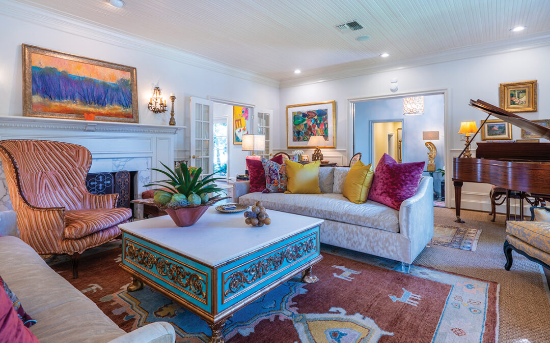
The monochromatic wall/floor scheme highlights to perfection the orange-upholstered sofa anchoring the living room. Nestled about are needlepoint pillows created by the owner’s mother and echoing the central figure in a rare antique Heriz rug in hues of cinnabar, teal and gold. Rugs serve a similar function to that of walls, advises the owner: “They are background pieces.”
A coffee table of glass and chrome serves the sofa, and a glass and chrome side table holds hand-painted primitive boxes from India. Beneath the table is the graceful figure of a reclining tiger. “I’m a tiger person,” says the owner, as she points out that numerous images of the sleek creature are found throughout her home.
Above an adjacent distressed Mexican chest in gold and black is a painting in the style of Picasso by Felipe Orlando of Santa Fe. Nearby is an intricately carved chair from China. It was purchased by a relative of the homeowner at port of entry when the individual who ordered the piece failed to claim it.
The living room’s Barcelona couch of Spinneybeck Volo leather and hand-polished stainless steel is the design of noted architect Ludwig Mies van der Rohe. The piece was created for the German Pavilion at the 1929 International Exhibition in Barcelona. The furniture line is marketed in the United States and Europe by Knoll Inc., a company founded in 1938 to offer furnishings created by world-renowned architects and designers.
An exquisite display of art lines the newly created living room wall and holds the works of local artists Joe White Nicholson, Bill Reilly, Cecil Casebier and Chester Toney. Bruce McKay, Norman Narotzky and Hugh Gibson are also represented.
Gibson is from Taos, New Mexico, and it was during his stint as a violist with the San Antonio Symphony that the homeowner saw and purchased his work. Above a black granite credenza in the dining room is another Gibson painting — “Belshazzar’s Feast.” It is an oil encaustic created by applying a heat source to the finished work so that the medium melts and a unique shiny texture evolves.
A sculpture by Nicholson sits beneath the painting. Another Nicholson sculpture, the stone bust of a dignified woman, is located on the terrace. “She was a housewarming gift in my first home and reminds me of my grandmother,” muses the mistress of the home.
Above the dining room table is a clever halogen chandelier with tiny fluted glass fixtures. “The fact that it was a good-looking piece of chrome is why I bought it,” confirms the owner. It complements the glass and chrome dining table surrounded by caneback chrome chairs.
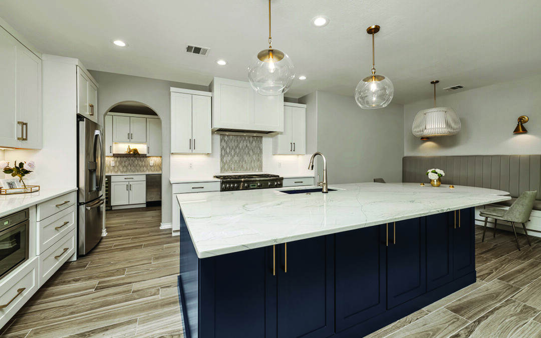
The adjacent kitchen is resplendent in elegant white cabinetry and black granite counter tops with mirrored backsplash. Updating the kitchen was enjoyable, but there was a domino effect, says the homeowner, in that replacing one thing led to another until soon there was not a remnant of the old kitchen remaining. “Choosing everything, even the faucets, was fun,” she recalls.
The kitchen pedestal table from Knoll is by another noted designer — the celebrated architect Eero Saarinen. Serving the table are side chairs created in 1952 by Harry Bertoia for Knoll. The owner’s daughters had their own child-sized Bertoia chairs.
The bed in the master suite holds a tailored bedspread in nubby orange fabric by Knoll. A small Lucite side table is the work of a New York artist whose name is lost, laments the owner. She was in San Antonio briefly as part of a Witte Museum group show on Lucite and modern materials. “I adore it. Plastics are my thing,” happily declares this modernist homeowner.
Flanking the bed are two colorful ceramic hanging lamps created and hand-painted by the late Martha Mood, who was primarily noted for her fabric and needlework creations. “Martha and her husband designed all the light fixtures in my original house,” notes the homeowner. The two fixtures are the only ones she moved to her new home. The safe installation of these one-of-kind treasures gave the owner pause.
A “womb chair” and ottoman are upholstered in a cayenne boucle fabric stretched over foam on a molded, reinforced fiberglass shell. They are a 1948 design for Knoll by Saarinen.
One of the owner’s primary concerns in moving to a new home was her collection of books — an enormous assortment of volumes chosen for research as well as for leisure and pleasure reading. A massive bookcase along one wall of her bedroom solved her dilemma, and she credits Williams for that solution.
A hallway leading to the study holds a unique abstract by Charles Pebworth — a work combining stainless steel and oil with an insert of a rust-colored carnelian.
The study is the ultimate in organization with built-in features for computer, files and all manner of work-related accouterments. A Knoll day bed and chest join a kilim rug. Bolsters give the bed the appearance of a small sofa. In retirement, it is here the homeowner designs and makes elegant necklaces marketed locally and throughout the country. She is an artist in her own right.
Author: Kay McKay Myers
Photographer: Al Rendon


0 Comments