Vacations in Santa Fe and Taos were foremost in the minds of Dorothy and Ray Berend when they built their home enchantingly hidden midst lush greenery on a serene cul de sac within a North Central San Antonio gated community.
Ray is a certified public accountant and partner in Padgett Stratemann & Co., while Dorothy is in partnership with longtime friend Betsy Strauch in an interior design business, Pure Elegance Inc. The couple has two daughters, Chris and Kelli, who were out of college when their parents moved, and they now have families of their own.
“It was the New Mexico architecture I fell in love with,” says Dorothy, recalling “arches, rounded corners and the softness of it all.” She continues with a smile, “I felt our (local) culture was sort of related to New Mexico, and I wanted to have that at home — a vacation at home.”
Just beyond the exquisite leaded glass front door is a narrow entry with a high ceiling not unlike a small New Mexican grotto in itself. It is warm, welcoming, richly appointed, and it looks beyond an arched window to a quaint garden.
Furnishings within the home marry the new and the old with an emphasis on elegance and comfort. As a designer, Dorothy knows whereof she decorates. It is a gift she shares beyond her home as a volunteer with Roy Maas’ Youth Alternatives, a program dear to her heart for 15-plus years. More on that later. In working with architect Roy Braswell and custom builder Roberto Kenigstein, Dorothy mentions she had three priorities: golden oak hardwood floors like those she remembered from girlhood, lots of light and high ceilings. “I was flexible on everything else,” she adds.
Walls in the home are the creative work of Mario Velasquez Sr. and his son, Mario Jr. They reflect a Monterrey finish, but the color came from a butternut squash Dorothy noticed in a Thanksgiving dinner centerpiece. She laughs, relating that she held the squash against a wall for the Velasquez duo and said, “This is the color.” Mediterranean gold is the more dignified (but not nearly as much fun) name for the hue. Cabinets complement in a soft taupe.
Colors throughout the home reflect nature as seen from almost every room. “I tend to work with rich neutrals,” says the homeowner. Neutral, however, is not synonymous with monotonous, nor does it constitute drab — quite the contrary. With a designer’s flair, Dorothy contends neutrals go far beyond beige tones and into stimulating greens and inspiring variations on terra cotta. From there, it is so easy to accessorize and focus on color, she explains.
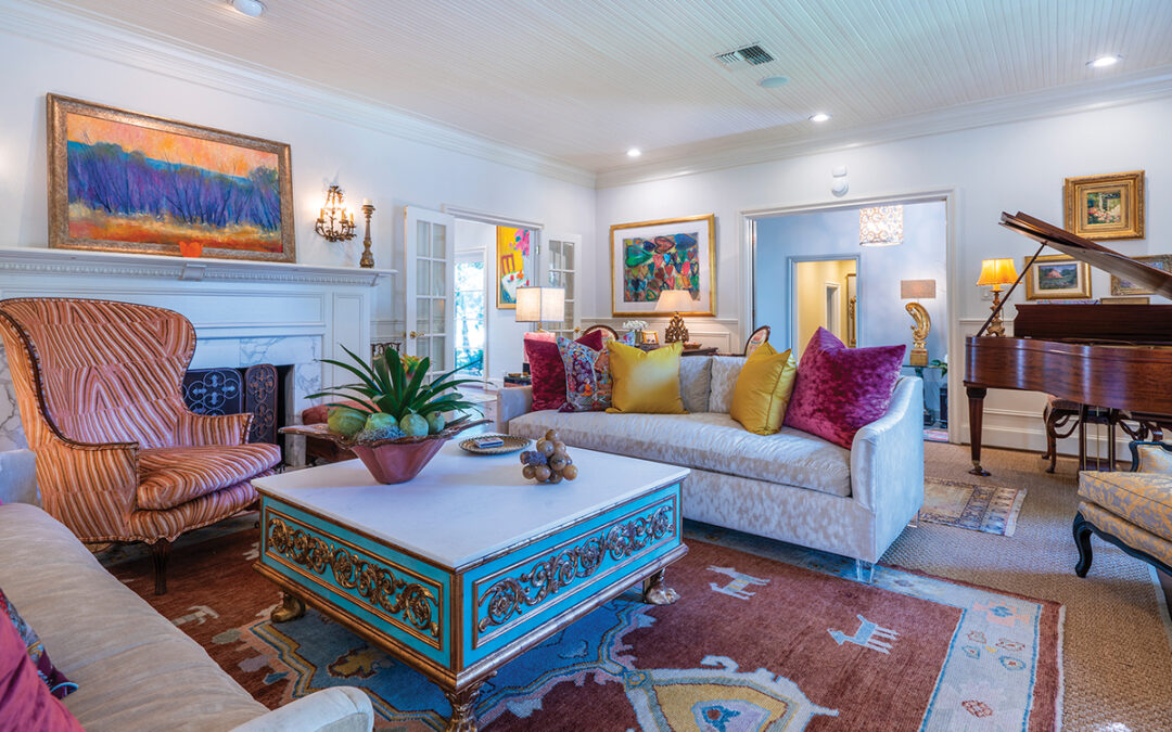
Her living room is a textbook example. Sofas facing one another are a tone-on-tone ecru fabric, and nearby chairs move into darker shades. All are splashed with colorful throws and multiple pillows which combine various fabrics and designs in a wealth of colors. They testify to the homeowner’s confessed weakness for “rich silks, tassels and pillows with fringe.” More color emerges from the black and terra cotta Bokhara rug beneath the beveled glass coffee table. It sits on an iron base with brushed gold finish.
The mantel and fireplace surround, flanked by built-in cabinetry, are gray Adoquin, the spoils of a trip to “Hector’s,” says Dorothy. The stone came from “a yard where mountains of things were piled high that a wonderful man named Hector would import,” she explains. Alas, Hector’s no longer exists.
Art in the room is scarce, says Dorothy, but modesty forbids that she recognize her own devised artistic scenes to be as rich as a painted or sculpted work. Above the mantel is a Moroccan door. Side panels were removed and flank the middle section, centered with elaborate grillwork, beneath which Dorothy placed a colorful elephant blanket. Nearby, a Kilim rug in shades of terra cotta to crimson hangs on a wall. Across the room, a carved Mexican door adorns another wall.
Accessories are numerous, and the mantel carries a collection of colorful eggs spilling from a small box. Daughter Kelli covered the spheres with paper in all manner of designs. Highly lacquered, they appear to be delicate porcelain. On a wall is the violin that belonged to Dorothy’s father. He also played the flute and accordion without ever having had a music lesson.
The egg collection and violin are examples of accessories important to the homeowner. “I have many accessories, love all kinds of things, but I enjoy and always use those things people have given me,” says Dorothy appreciatively. With a prudent bent, she moves accessories around “a lot,” completely changing the look without purchasing anything new.
“When Betsy and I do a (house) makeover, people think they have to get rid of things before we come, and they hide what they think is no good in the garage,” explains the designer. “We encourage clients to think outside the box, put everything (their questionable items) into one room and make that the ‘magic’ room, and we draw from there. They do not have to buy new things, and we almost always use everything a client has in ways they never dreamed — even salvaging and recycling flower arrangements.”
In the Berends’ dining room, artist John Crawford’s mural transforms the room into an Italian marketplace scene with gardens trailing off to one side. The ceiling is painted to resemble a tent canopy, while surrounding walls continue the theme. Harmoniously, crimson and gold iridescent striped curtains flow behind a credenza where feathered shades on buffet lamps lend a touch of whimsy.
A painting signed “Diego Rivera a la Strauch” hangs on one wall. Painted by her business partner as a surprise gift, the excellent Rivera knockoff necessitates a double take and check for a signature.
The pecan parquet dining table is “early marriage and one of our first really good pieces,” mentions Dorothy. On the table, beneath a diminutive trunk, she has swirled a burgundy throw beneath a sheer iridescent gold scarf. Offering another design tip, she says, “I encourage people to pull things like these from drawers and use them (in décor).” Illumining the room is a chandelier adorned with acanthus leaves in a finish resembling stone.
The master suite is a comfortable, albeit elegant, retreat. A coverlet from Lin Marche Fine Linens centers the bed, which stands higher than most. “I always tell clients to raise a bed,” says the homeowner. It lends a regal quality to the room. Flanking the bed are bombe chests. Traditional nightstands would have been dwarfed, and the chests offer extra storage, notes Dorothy. Plantation shutters are found at windows in a comfortable bay seating area.
Art in the room includes two watercolors by Janet Campbell, one of Dorothy’s favorite artists. They hang over the bed’s tapestry headboard. Nearby are two prints by the late Darryl Trott, the famed Australian painter and Austin resident, internationally acclaimed for his floral works.
Dorothy’s design talents do not stop at her home’s threshold. Her gardens are filled with flora and fauna, including deer and a little grey fox. Unique plant containers abound, holding exquisite plants. When a terra cotta urn or pot is broken, it becomes part of the landscape. Partially buried, it emerges from the ground as if it were a treasure awaiting archeological discovery. A cedar arbor centers the backyard and invites repose on twig furnishings. It is but one of many separate and intriguing locations in the yard, which is situated on a greenbelt. A bright blue bench is reminiscent of the Santa Fe doorways traditionally painted a similar color for good luck.
Speaking of the homeowner’s design gift and returning to her commitment to Roy Maas’ Youth Alternatives, Ray has long been on the board, and Dorothy has volunteered and contributed to the Thrift Store, 3103 West Ave. Youth Alternatives is a program that has been helping children in crisis since 1976.
Dorothy is responsible for the spectacular décor in the Thrift Store, a scheme that reflects the purple, hot pink, teal and gold in a jacket once donated for resale. Under her leadership, the store closed for a month while walls, columns and display shelves took on the vivid colors.
Admitting that she is not schooled in the disciplines required to counsel youngsters, Dorothy says she can spend one day weekly to maintain the spiff-up and help with store display. Her creativity and knowledge of design elements most certainly attract passersby into the store that, in turn, supports the needs of scores of children.


0 Comments