Jan and Roger Hill’s transition from a spacious Terrell Hills home to a smaller living space four years ago was not as difficult as one might imagine.
First of all, three adult children were delighted to accept hand-me-down furnishings. “It was so nice to be able to give to them whatever we didn’t want, and they liked getting it,” says Jan enthusiastically. Additionally, only two new furniture purchases were required for the townhouse they chose.
Finally, yet importantly, the new space was but a shell, giving Jan and interior designer Derrick Dodge, ASID, a blank canvas and many options for creating what has become a serene and exquisite environment. John Kefauver was the contractor for interior finishing, mentions Jan.
The two-story dwelling is concealed behind high stucco walls and a security gate opening to a welcoming courtyard. The front door is a unique adaptation of a quaint Dutch door. An inset of wavy glass lends a touch of antiquity to the top portion, which holds a graceful arched half-door opening to the inside.
The entry with its high barrel ceiling is illuminated by a chandelier from The Lion and Eagle. A mule chest centering the area is a generous-sized coffer with a traditional hinged lid. Purchased by the Hills in Europe, it provides grand storage for Christmas décor, says Jan. Eighteenth-century chairs with their original tapestry upholstery and fringe flank the chest. “They must have been side chairs that people did not sit upon,” speculates Jan, noting the fabric’s pristine condition.
A striking focal point in the entry is a Renaissance scene in fabric created by the late Martha Mood. It is one of two commissioned by Roger’s mother, who knew the noted fabric and needlework artist personally, says Jan. The wall hanging’s colors and dimensions were determined by the specific space for which it was originally intended, but it perfectly suits the area in which it is now displayed.
Floors in the home are acid-washed travertine, and the entry floor is of exceptional design. Dodge explains, “The entry tiles are set in a trompe l’oeil pattern similar to those seen in 18th-century French and English estates.” The tiles vary in shade and are placed to create a three-dimensional effect, almost looking as though there were a step down or a step up here and there.
Though ceilings are extremely high in the home and massive windows create an open feeling, there was a need to create the illusion of greater space to adequately display the rich furnishings in intense Old World colors. This was accomplished, says Dodge, by incorporating the design element of continuity from room to room. In the Hill home, he has successfully orchestrated complementing colors, textures and fabrics along with surface finishes and products extending from ceiling to floors.
“A cohesive visual is paramount,” he explains. “Basic design rules make a house look right and correct, and that separates the novice (designer) from the professional.”
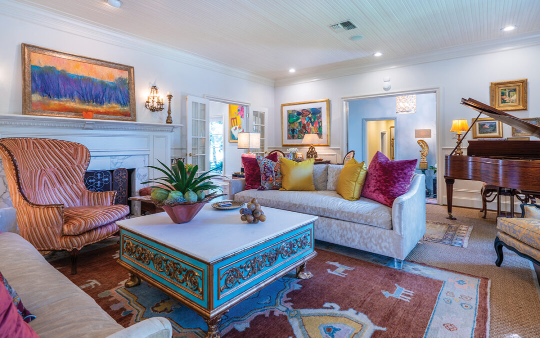
The Hills’ formal living room is awash with rich fabrics in shades of vivid red varying from rust to crimson. Floor-to-ceiling cabinetry flanks a custom limestone fireplace mantel above which is a painting by R.J. Onderdonk. It belonged to Roger’s grandfather, says Jan. “We had it restored and were amazed at the light that emerged afterward.”
The cabinetry shelves are resplendent with the couple’s extensive collection of Staffordshire and Majolica. Family photos abound, as well.
Cabinets, tall baseboards and window surrounds carry a fruitwood stain glazed in transparent taupe to achieve color and depth. Floors are travertine, centered with a soft beige wool sisal rug.
Walls are a textured finish in taupe. Arched door surrounds have an applied faux-stone treatment reminiscent of what one might find in an ancient castle. Windows are dressed in a Chinese lacquer red woven moiré; Roman shades in a natural fiber material filter harsh light.
The room is a pleasing vision with fabrics of varying design and texture and pillows tossed there and about to lend opulence. Jan shares a tip she learned from her designer. “Working with him through the years, I found you can use pillows for impact in a room,” she explains. “You can save money on other things by taking a standard store-bought piece (of furniture) and using expensive fabrics on pillows.” Voilà, a splash of superb sophistication is achieved in a creative and relatively frugal manner.
Furnishings are an eclectic blend, confesses Jan. “I am not a purist, and I am very sentimental, so I incorporate what I have inherited from one grandmother or another.” An elegant breakfront is just such an heirloom. Centering the room is a massive, deeply tufted ottoman. Designed by Dodge, it is an ideal surface on which to place a tray of drinks and hors d’œuvres. A small gateleg table serves a seating area, as does a glasstop coffee table on an iron base.
The Hills’ dining room beckons with no small amount of drama. Centering the gilded copper coffered ceiling is a Queen Anne crystal chandelier of splendid proportion and design. It was purchased from Don Yarton Antiques and is one of two such fixtures that for years graced the Frost Bros. bridal salon on Houston Street in the heart of downtown San Antonio. Through the years, the fairytale images of hundreds of starry-eyed brides were reflected in those very crystals — this writer among them more than 46 years ago.
Proof of the chandelier’s authentic Queen Anne design, points out Dodge, can be ascertained by a trained eye. It reflects a specific pattern on the ceiling when viewed from directly under the fixture.
The dining table was an “early marriage” purchase, and the tabletop has been refinished in a faux marble, while the legs are finished to resemble stone. Damask wallpaper in red and gold is an elegant background for more of the couple’s Majolica collection. An Oriental rug from Aziz complements.
A painting by San Antonio’s own noted watercolorist, Beth Eidelberg, depicts the three Hill children as youngsters at play. Another “early marriage” acquisition is a painting of the Texas Hill Country by Robert Harrison. A clever three-tiered demilune table carries Roger’s collection of wine bottle openers, horns and corks. The table was formerly a plant stand, and wine bottles rest in the plant holders.
The acid-washed travertine floors in the dining room and adjacent foyer leading to the kitchen and family room carry an inset of oak at the room’s perimeter. “I don’t like to see flooring die into a wall,” says Dodge. Not only does the oak framing lend elegance to the dining room and foyer, it lends continuity and makes for a cohesive flow to the adjacent area, where oak floors are the dominant feature, he adds.
From the kitchen and informal family room, French doors lead to a courtyard where seasonal blooms abound. Taupe cabinetry and granite counter tops are in abundance. The venthood finish represents more of the faux-stone application. Speaking of the area, Jan says with a smile, “This is how I got my husband into the kitchen.”
In actuality, the family room is basically the living room from their former home relocated and refitted into their new living space, albeit with a bit of reupholstering and refurbishing.
Once more, floor-to-ceiling cabinets offer generous storage and display. Roger’s collection of “match strike” Majolica is on view. As one who enjoys doing needlepoint, Jan greatly appreciates several framed antique examples which hang in the room. A framed collection of vintage sewing paraphernalia joins the grouping.
Gracing a wall on a nearby stairwell landing is a unique work of art — the train from Hill’s daughter’s gown when she was a duchess in an Order of the Alamo coronation.
The master bedroom is anchored by the king-sized bed graced with a Marie Antoinette canopy in an ecru dotted strie moiré. The counterpane echoes the moiré fabric and reverses to violet. Massive pillows in prints and solids dot the bed. Jan mentions that her previous bedroom was painted in purple and lime green. The current décor is several tones down from the former palette.
Jan’s grandmother’s diminutive secretary is now hers. “I picture her sitting at the desk,” she reminisces. A collection of Eidelberg watercolor paintings represents Jan’s years with the Junior League and her year as president. Among the images are scenes from the Bright Shawl and other buildings on the League’s near-urban property.
Vintage family photos grace one wall. A painting of Jan as a child joins the grouping, and the dress she was wearing is framed nearby. Her children’s christening gown and cap are also displayed on the wall. The frame has an easily removable backing to gain access to the garments for the christening of future grandchildren.
Jan lauds the luxurious master bath as her “favorite room.” Travertine columns define the elegant space, which holds his and her closets and a retreat of lavish marble in which to relish relaxation.
Author: Kay McKay Myers


0 Comments