Joe and Linda Aceves have a moving marriage. Literally. “This is the eleventh move we’ve made in 24 years of marriage,” Linda says of their relocation to the Vineyard in Northwest San Antonio. They aren’t career military, she adds. Joe’s work doesn’t require frequent transfers; he manages Bexar County’s Department of Infrastructure Services.
“We just enjoy building houses and decorating them. We’ve been in this house about four years, and we’re still enamored with it, but who knows? At some point we might change our minds and build another house,” she says. The last time they got the itch to move, they were living in another gated community in San Antonio. The yard was small and the view became undesirable, so they began searching for a place to spread out. They found a big corner lot on a higher piece of ground in the Vineyard. “Monticello Homes built the house for us,” Joe says. “It was a real challenge for them because they had to blast so much rock out to construct the foundation. There’s literally no topsoil out here.” The couple modified one of the builder’s floor plans to meet their lifestyle. “Initially, the house didn’t have a private courtyard,” Joe says. “We added that. We moved some walls and took out a door or two. In the original plans the back porch was smaller, so we enlarged it.”
No decorator needed
Linda did all the interior decorating for the 3,500-square-foot home. “I love decorating and consider it a creative outlet,” she says. “I find great items at Pier One, Too Good to Be Threw, Tuesday Morning and a few other places,” she adds. “There’s no law that says furniture and accessories have to cost an arm and a leg to provide beautiful décor. We’ve also discovered the thrill of repurposing furniture, rather than getting rid of it.” Linda and Joe chose a palette of earth tones, ocher and terra-cotta for their walls to complement the scale of the rooms and the size of their furniture. While husbands and wives often clash when it comes to selecting colors, tile, and the hundreds of small items that go into finishing out a custom home, they had no problems. “Our tastes are very similar,” Joe says. “That made it fairly easy.”
“The only thing we would do differently if we built this home again is eliminate all the carpet in the house,” Linda says. “We’ve found that we really love the tile floors.”
Speakeasy entry
The tile begins in the entryway, which is guarded by a heavy wooden door with a speakeasy window instead of a peephole. “I hate peepholes!” Linda exclaims. “They are always too small. With the speakeasy, I can open this little window in the door and get a good view of the visitor.”
“Of course, that’s assuming they get past the locked iron gate in the courtyard,” Joe chuckles.
The entry’s soaring ceiling is wooden tongue-and-groove paneling. A black wrought-iron chandelier hangs from the center, lighting an unusual piece of artwork hanging to the right of the door. At first glance, it looks like a large piece of modern art. It’s actually a recycled room divider. “During one of our moves, we discovered we weren’t going to have a place to use this screen,” Joe explains. “Linda loves this piece and was determined to find a way to use it. So we took off the hinges and hung it as wall art. Visitors always comment on it. In this house, the golds, browns and charcoal colors in the screen help tie in the other colors in the room.” The entry flows into the dining room on the left. Large windows overlooking the courtyard let in natural light that washes over the unusual dining table. “Joe had in mind a certain kind of table for this room,” Linda says. “We searched and searched and finally found this African mahogany table at a local resale store. The only problem is that the mahogany is so heavy that once you sit down, it’s hard to move your chair to get up.”
The far wall features a large niche that accommodates a bar of Joe’s design. The niche wasn’t in the original floor plan; the couple added it to fit the bar. The Aceveses store their liquor inside a huge armoire that was once an entertainment center. “We didn’t want to get rid of this piece when we moved here,” Linda says. “With a little shelf work, we were able to repurpose it into a marvelous storage area for wine and spirits.” Joe and Linda added another large niche in the living room to accommodate Joe’s entertainment center. “We had to have a special space for his big-screen TV,” she says.
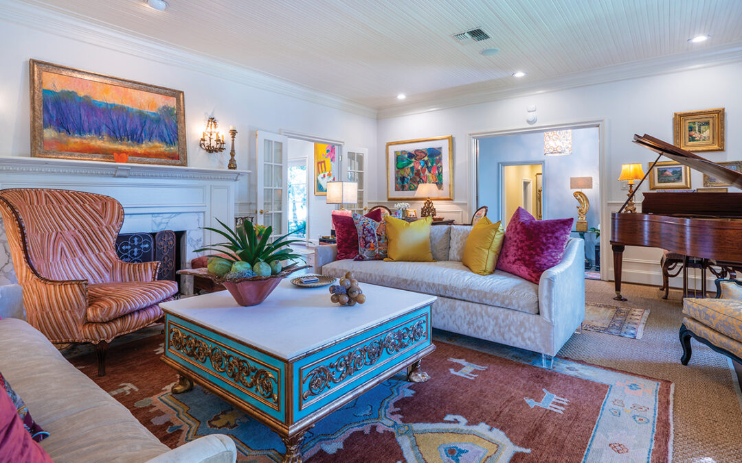
A large overstuffed sofa and chairs provide seating for viewing. A big square coffee table anchors the seating area. The table is surfaced in tile, making it a fuss-free serving area for drinks and snacks. “The tile surface means I never have to scramble for coasters,” Linda says.
Big kitchen hosts multiple chefs
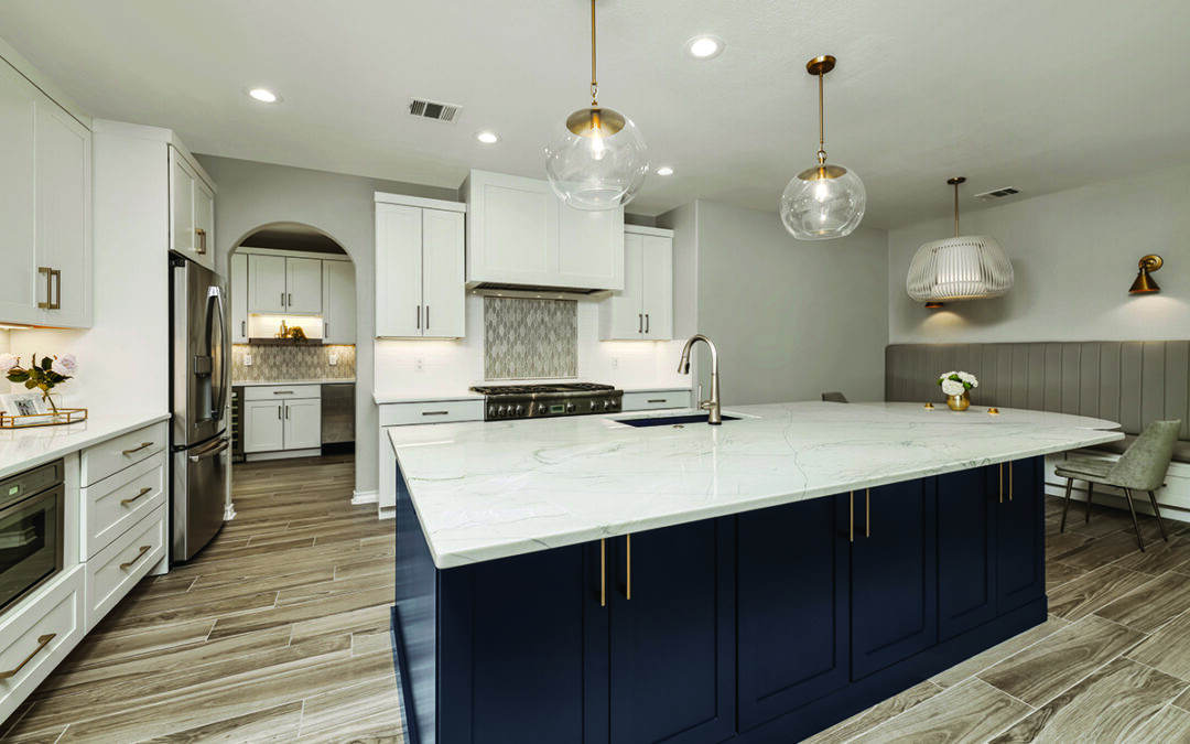
The large kitchen features black granite countertops. “People tried to talk me out of them, but I just had to have them,” Linda says. “They are one of my favorite parts of the house.” The large center island is long and narrow, unbroken by sink or appliance. “We do food preparation here and use it as a serving bar when we entertain,” Linda says. “It’s big enough for several of us to work on at the same time, which is important because our family likes to cook together.” The master suite, located off the kitchen, is a series of three rooms connected by pocket doors. The furniture in the bedroom is hand-carved wood in the Mexican tradition. Several pieces of art created by Joe’s daughter are prominently displayed. A large flat-screen television is mounted above the armoire.
The master bath is commodious and features high ceilings, granite countertops, tile flooring and wide arches over the garden tub and double walk-in shower. The walls are bronze-textured through a special faux painting technique. Storage cabinets abound, and a niche near the ceiling holds a small television set, angled for viewing from either the tub or the shower.
The room has excellent air circulation, something lacking in many bathrooms. Joe explains that every room in the house has a return air vent, so fresh air constantly circulates. “This keeps the humidity down in our bathroom, so it’s always comfortable,” he says.
Walk-in closet has convenient features
A double door on the far end of the master bath leads to a spacious walk-in closet. Linda has all the clothes organized by color and type and hung on non-slip hangers. “It’s much easier to find what I want when I keep it organized,” she says. The most unusual feature of the closet is through another pocket door — it opens into the utility room. “When my clothes come out of the dryer, it’s a very short walk to hang them up,” Linda chuckles. “It’s very convenient.”
The door on the other side of the utility room opens onto a small foyer that leads to the kitchen and the garage. A large built-in cabinet serves as a kitchen appliance garage. “I’m not the kind of person who likes to have all the kitchen appliances sitting out on her counters,” Linda says. “I’m a neat freak; I want everything put away where it belongs. This cabinet is just the right size for all those bulky things you only occasionally use.”
Hidden cabinets
Down the hall, French doors open into Joe’s sunny office, which overlooks the front yard. The desk, credenza and wall unit are of a sleek modern design. Something, however, is missing. Where are the file cabinets? Every working office must have file cabinets somewhere. Linda smiles and opens the walk-in closet door. “We didn’t install the hanging rods so we could put the filing cabinets in here,” she says. “We’ve never liked looking at file cabinets, so we put them in here with our bookshelves. It opens up the room and keeps the office tidy.” Linda decorated the guest room with a low black platform bed matched by a long, low black bookcase on the opposite wall. Another large modern painting by Joe’s daughter is the focal point for the space. “I like the aesthetics of Japanese decorating, so I decided to use them in this room,” Linda says. “I really like the way it came out. The dark colors of the wood complement the ones used in the painting.”
Wii room
When it seems like there could be nowhere else for the house to go, Joe points out Linda’s small office behind the fireplace in the living room. Built-in cabinets and a desk occupy a space about the size of a sneeze. “That’s Linda’s command center,” he says. “Small but efficient.” The command center opens into what Linda and Joe fondly call their “Wii room.” The room was originally a smaller bedroom, but Joe asked the builder to enlarge it by removing a door onto the back porch. “This room is actually bigger than our own bedroom,” he says. “We enlarged the room, thinking that at some point we might need a suite for a long-term guest. Then we discovered Wii!”
The room became an exercise haven, where Joe and Linda play Wii tennis, bowling and golf on a regular basis. A treadmill occupies a corner of the room. Comfy couches are pushed back against the walls for recuperative periods.
The next move?
While the couple jokes about making another move, they acknowledge that this house might be the last move for them. “We love the house,” Joe says. “It fits the way we live. And we were careful to design it all on one level, so if at some point we become disabled and need a walker or wheelchair, the house will still easily accommodate us.”
“Thinking about what we really needed in a home paid off for us,” Linda says. “I think we may stay here awhile!”
Author: Robyn Barnes
Photographer: Al Rendon


0 Comments