Robin Black, ASID, IIDA, RID, and Fred Williams, AIA Emeritus, are a talented couple wellknown in San Antonio’s interior design and architectural fields. For years they lived in a spacious, elegant home on Elizabeth Road in Terrell Hills, near the San Antonio Country Club.
And then they moved to what Robin affectionately calls “a real challenge.”
“I know all our friends thought we were crazy to sell our beautiful house and move here,” she says. “But the reality of the situation was that the Elizabeth Road house was worn out, and the value of the land eclipsed the worth of the 1947 structure and caused us to move. As we weren’t getting any younger, and in our early 60s, we realized that it was time to downsize.” Their requirements were simple. They wanted a one story home in an older neighborhood inside of Loop 410 close to established retail centers. The house they found in Bel Meade, near Fort Sam Houston, met these needs. And it provided mature landscaping and a garage apartment that could serve as an office for Robin. Their corner lot is on a culdesac with a city park in the back, so traffic noise is minimal. They relocated in 2005 and began renovating the 2,400 square foot house. “We fixed the foundation first; it was really in bad shape,” Robin says. “Once that was done, we began working on a plan that would meet our needs. When Robin Black and Fred Williams bought a ’50s era house in Bel Meade, they knew it would require some conscientious remodeling. Today, it holds their collection of folk art, fine art, modern classics and antiques from Early Texas, Mexico, England and America. “We wanted to design a barrier free home with all the appropriate ADA requirements so we can age in place,” she continues. “We want to live independently in our home as long as we can.”
SUSTAINABILITY A PRIORITY
Paramount was the desire to build a sustainable home. “Most important to the questions of sustainability in this house was the complete reuse of existing housing materials,” Fred says. “A significant portion of existing siding, doors, windows and carpeting was recycled instead of being put in a landfill. To be compliant with code, the water heater was relocated into a hall closet, as it was within inches of the furnace. Low flow toilets were installed, and exhaust fan/lights were added to the bathrooms. The tub in the hall bath was removed, and a walk in shower with a bench and hand held shower was installed. All the interior solid doors were replaced with fully louvered doors to allow for improved ventilation. Even the landscaping, though some was mature, was relocated to provide better privacy.”
Robin says the fun in sustainable design lies in finding the right materials. “It’s a little like a treasure hunt: You have to know where to look,” she says. “For instance, Fred found the 26 three foot wide pine louvered doors at the Habitat ReStore. There’s not a thing wrong with them, and they’d have been costly if purchased at retail price. At the ReStore, we got them for less than $50 a door.” Sunlight was another requirement for the couple. “Did you know that a person needs 15 minutes a day of sun just for good mental health?” asks Robin. “Hospitals have a better success rate of healing with patients who are near windows with sunlight, and offices have loyal workers when daylight is part of the interior. “The house was dark,” she adds. “The sunlight requirement is why we have so many windows in our rooms. The pre-existing windows were old and small; Fred opened up the rooms and installed larger double glazed windows and in some rooms, five light doors in place of the windows.”
The house has no carpeting; all the floors are of white or red oak. You won’t find draperies hanging at the windows, either. “This house was built in 1953, and a number of the windows were covered with Venetian wood blinds,” Robin says. “We took them down for refinishing and then retaped and rehung them. To reuse items is the right thing to do — it makes me feel less wasteful. It just makes economic and ecologic sense.”
EVERY SQUARE FOOT COUNTS
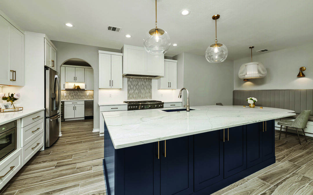
“This house is smaller than our previous home, so we knew we’d have to make every square foot count in our design,” Robin says. “As a registered interior designer, I know that every line I draw on a client’s project is something that has to be paid for; I do the client a great service every time I find a way to make a space multipurpose. The same principle holds true in our house.” Nowhere is this more evident than in the galley kitchen. “I knew we had to change this kitchen when I saw it!” Robin exclaims. “It was dark and the finishes were not our choice. “Fred relocated the doorway into the dining area to alleviate the dead end corner and replaced the two small windows over the sink with a wall of windows that let in glorious sunlight and views to the yard. Then he added the bar height counter and a long run of lower cabinets with another counter in what was a big open space. This created a bar area where friends gather while I cook. “The wood cabinetry was ripped out and sent to the Habitat ReStore and was replaced with stainless steel appliances and custom bamboo cabinets. We used matte finish glass tile on the backsplash in colors that complemented the Jerusalem limestone countertops.”
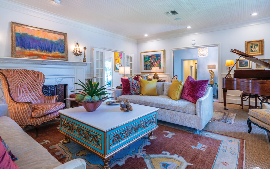
The kitchen is decorated with folk art. Wooden snakes from Santa Fe are featured here and scattered throughout the home. Antiques from Early Texas, Mexico, England and America plus modern classics are important to the couple, too. “One of the big reasons we bought this house was because it had a space for this big old pine counter,” Robin says, pointing to the piece at the end of the room. The cabinet came from an old general store and serves as a display for folk art.
PORCH PROJECT
Back porches in houses of the 1950s were rarely serviceable, and this home was no exception. “The pre existing covered porch was useless in the Texas summer heat and no defense against insects,” Fred says. “We created an ‘Arizona Room’ to function as an outdoor entertaining area for larger groups.” The room is accessed through double sliding glass doors from the family room or a screen door from the breezeway. Fred paved over the original concrete slab with Arkansas River stone and did the same on the exterior walkways and front porch. The porch was entirely screened, and ceiling fans were mounted. Fred also installed exterior down lights to highlight the potted plants. The porch’s most unusual feature is the open raised concrete (CMU) fireplace, located in the far corner of the room. The hearth forms a short bench on either side of the sloping walls. The fireplace is a cheery focal point for chilly evenings.
ART AND HEIRLOOMS
A narrow hallway from the family room displays large framed maps and art. There’s a bird’s eye view of Paris, where Robin attended school for two years. Several black and white photographs by Dallas’ famed photographer and architect Frank Welch, FAIA, are prized possessions. A colorful Fiesta poster adds a splash of color to the area as well as a surprise. “Remember when I said good design serves multiple purposes?” Robin asks. “This poster hides the fuse box. We couldn’t relocate it when we rewired the house, so we used the space to hang art.” An alcove at the end of the hall is sized for an antique ship’s chest, used to hold Robin’s mother’s Dresden china. “I haven’t got a china cabinet, but it turns out I didn’t need one,” she says. “All the pieces fit here perfectly. It’s another rule of recycling: Try using what you have to meet a current need.”
The master suite is accessed through a small sitting room furnished with antiques. A large glass front cabinet displays Fred’s shirts, which come back neatly folded from the dry cleaner. The massive wooden bureau across the room came from Hondo and serves as a dresser. A console table displays family photos and an unusual lamp with a wallpaper roller base. The master bedroom is a place of repose, with simple accents and subdued colors. A prayer chair from France, an old pine table from Mexico and paintings done by Robin’s mother attract the eye. A small dressing room between the master bedroom and bath features custom made cabinets with pullout drawers to hold linens.
An old brass bed is the focal point in the guest room. Large fluffy pillows are inviting — and are a favorite napping location for one of Robin’s cats. “Fred and I are cat magnets; all four of our felines found us,” she chuckles. “For some reason, they are attracted to this room.” The formal living and dining room is at the front of the house. Two of the small windows on either side of the large picture win dow were covered up to provide more wall space, and five square windows were installed underneath this great window, affording a beautiful view of the neighborhood.
“At night, I can turn off the lights in this room and gaze out on the foliage highlighted by the streetlight,” Robin says. “I can watch my neighbors’ lights come on and enjoy the tranquillity of the neighborhood. It’s so peaceful.”
The finished product met all the couple’s goals and was featured on the 2009 AIA Homes Tour, as an example of renovation and green design. “We’ve come a long way with this house,” she continues.
“We call it Casa Finale because it is the last house we’ll remodel and hopefully the last place we’ll live. Renovating was hard work, but it was worth it. We get to live in a home with a minimal environmental impact and a major positive influence on our daily lives. What more could a homeowner ask for?”
The home was featured on the 2009 AIA Homes Tour. White oak floors are from Allen & Allen Co.


0 Comments