If you whiz up Interstate 10 toward Fair Oaks, as so many people do these days, you’ll pass a cream-colored stucco house with a red tile roof high on a hill, hidden behind brush and trees. The natural camouflage conceals a five-acre gem that is home to San Antonio icon Bill Dante, his wife, Lisa, and their son, Ryan.
Bill built the house more than 20 years ago on five acres that were so far outside of San Antonio that development beyond Loop 1604 — at that time — was still a dream. The Dominion was just empty land with a sales tent on it, and Fair Oaks Ranch was considered a long drive from downtown San Antonio. “Initially, I had pictures of 10,000-square-foot homes I loved and I’d show to Bill Davis, my architect. He’d look at them and shake his head. ‘Build quality, not quantity,’ he said. I took his advice and I’ve never been sorry,” says Bill. The builder was willing to let Bill serve as a contractor for the natural materials he wanted to use. He knew people in Mexico who quarried the marble he wanted to floor his home, so he went south of the border to purchase the material and bring it back.
“Today the quarry is closed, and I couldn’t begin to pay for this much marble,” Bill says. The same goes for the Italian marble in the dining room, the special outdoor light fixtures and the adoquin pavers and fireplace surround. By sourcing many materials himself, Bill was able to start building a 2,000-square-foot house that has evolved into 4,000 square feet of residential elegance.
Southwestern design
“I started off with a Southwest feel for the house,” Bill says. “That look and a peach and turquoise color scheme were popular 20 years ago. My art collection reflected the popular artists of that era, such as Michael Atkinson and Amado Peña.” The interior colors changed after Bill married Lisa, and the pair began traveling throughout Europe. They were drawn to the Amalfi coast and the Isle of Capri and brought the Mediterranean look and feel home to San Antonio. The Southwestern art and color scheme were replaced by gallery oil paintings and rich colors that reminded Bill and Lisa of the coastal country they’d so enjoyed.
“We’re lucky we both have the same taste in art and furnishings at the same time,” Lisa says. “Our design tastes have evolved together during our marriage.” Bill adds, “I think our taste is something that is classic and timeless. It’s something that we’ll enjoy for years.”
Building up and out
The Dante home remained in its original footprint until Ryan arrived, and Bill and Lisa realized they needed more space. “I needed a bigger kitchen,” Lisa says. “Bill’s bachelor kitchen was like a ship’s galley; there just wasn’t enough room for all the baby paraphernalia and us, too. We knew we needed to remodel, so we added a second floor over half the house.” “Imagine this,” Bill says. “We have a baby, and we take the roof off our house to add a second floor. Not only do we have to remove the roof but we have to significantly reinforce the floor of the second level and add a staircase. It was loud, hot and dirty all the time and it took months to finish.”
“Bill was working seven days a week back then,” Lisa says. “Fortunately, I was a stay-at-home mom. I made daily calls to Bill’s office to verify construction details to ensure that everything was done to our specifications. It was a hard job, but we’re glad we did it.”
Casa de Dante
To get a true feeling for the renovation, the best place to begin is at the front door. “We haven’t changed much in the entry hall,” Bill says, “but the coat closet has undergone a metamorphosis.” The hall closet is directly opposite the front door. In its new life, it is a wine cellar. Bill and Lisa wanted a wine cellar, but because the house is built on limestone caves, drilling a cellar was not a good idea. “The closet was wasted space,” he says. “It was full of stuff we didn’t use. We cleared out old clothes and sports equipment. I studied how to build a wine cellar and ordered the parts, piece by piece. We framed the door with unpolished travertine tiles to give it the same Mediterranean feel as the rest of the house. Now we have a wine cellar that holds 500 bottles.”
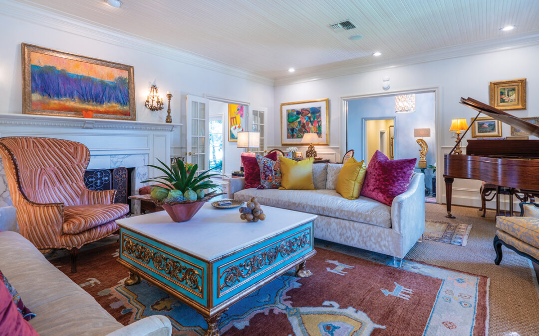
To the left of the wine cellar is the guest bath and Bill’s office; farther down the hall is the original master suite, which now serves as Ryan’s hangout. It’s a teenager’s dream, with a 60-inch television screen, gaming system, computer, surround sound and fireplace. It has its own master bath and a 12-by-12-foot closet. An exterior door opens onto the outside deck. To the right of the wine cellar is the main living area, whose focal point is an elegant fireplace with a large Impressionist seascape positioned above the mantel. Built-in shelves hold treasured family photos. A thick Persian rug warms the marble floor and is a perfect foil for the plush sofas. Windows in the east and west walls permit natural light to flood the room. Beyond the living room is the formal dining room and kitchen. Before the renovation, the dining room was separated from the kitchen by a wall and narrow door. “This was awful,” Lisa says. “That wall had to go. When we tore it out and expanded the kitchen, the whole space just seemed so much more comfortable.” The large dining table provides seating for eight. The table is perfectly aligned so that guests have a view of a large fountain through an east-facing picture window. Two tall, heavy candelabras guard the head and the foot of the table.
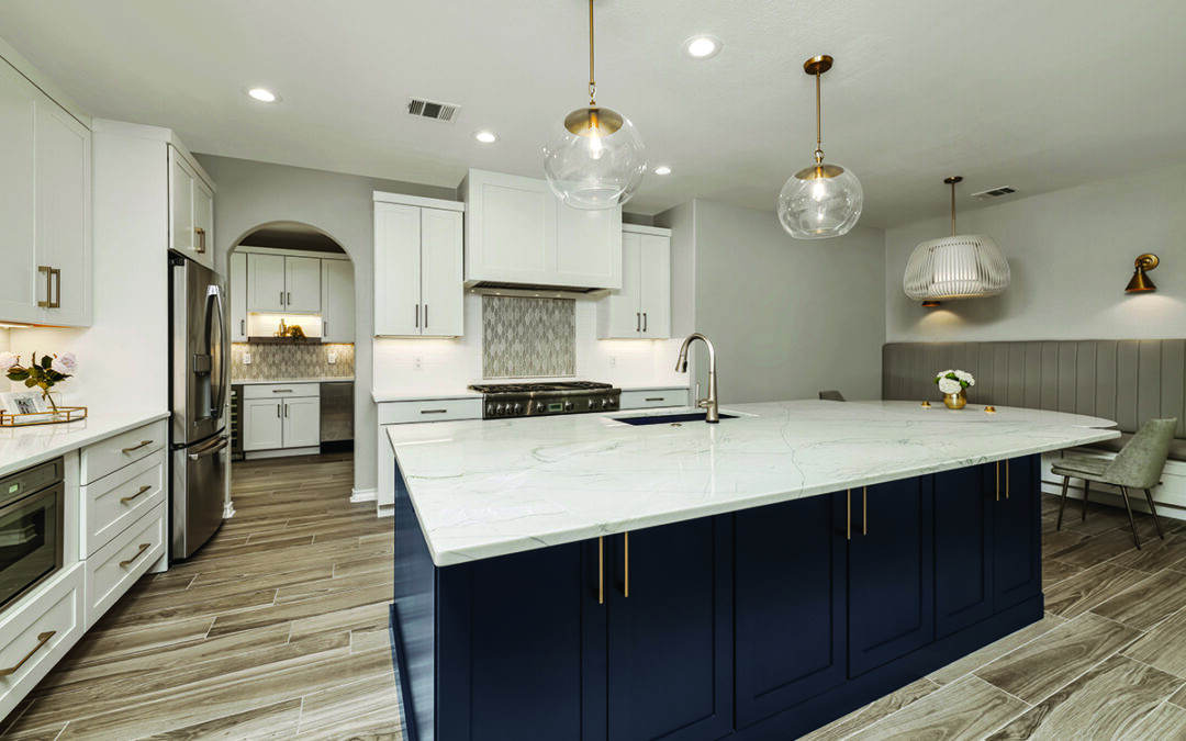
The kitchen at the opposite end of the room was originally 10 feet square; the renovation more than doubled its size. Thick granite countertops along one wall and on the island provide plenty of workspace. “This floating island is a story in itself,” Bill says. “When I told the contractor how I wanted to build it, he said it couldn’t be done. This was before kitchen islands with different counter heights became popular. I wanted a bi-level surface that was high and narrow on the west-facing side, so we could sit on barstools and look out the kitchen windows at the fabulous Hill Country view. The lower level needed to be constructed as a work surface. “The contractor said the granite would be too heavy; I said we could engineer the design to make it happen. We finally arrived at a design that incorporated specially built steel bars that supported the granite. We built spacious storage cabinets beneath the counters that are open on both sides, allowing us to store oversized items.” Accent tiles in the kitchen backsplash are of carved bronze. Bill and Lisa found the large tile over the stove during a European trip; it is actually an antique wine label press. Bill had smaller tiles removed from the backsplash and replaced them with his European treasure. “The miracle was that it exactly fit the available space,” Bill says.
Bill and Lisa both say that the best part of the kitchen is the view through the large windows. “We never get tired of sitting here and looking out the windows,” Bill says. The kitchen has multiple exits. One door opens onto the large back deck. The circular staircase leads up to a loft landing opening into the large master suite with French doors leading to a wraparound deck with a wonderful Hill Country view.
On golden pond
Perhaps one of the most spectacular features of the home is the “pond” in the backyard. What started as an offhand remark to a friend about how a pond might look good in the backyard ended up as a two-year tutorial in the proper way to build a stock tank. Bill learned to build it through trial and error; he visited small towns all over South Texas to seek advice from ranchers who had constructed stock tanks on their property. The result is a beautiful small landscaped lake with a central fountain and stocked with more than 200 Japanese koi. A 60-foot cascading waterfall splashes down to meet the lake.
“We love our home,” Bill says. “It’s perfect for entertaining, a great place to raise our son and a peaceful retreat at the end of the day. The home’s design evolves with us as we age; we plan to live here for a very long time.” “Who would want to leave here anyway?” Lisa asks. “With the fantastic view and the convenient location, who could ask for more?”


0 Comments