’50s ranch house gets new look
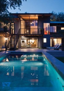
Suzanne Cavender frequently found herself walking her dogs on LaJara Boulevard, wondering if it was time to move from the Lincoln Heights home she shared with husband Rick. They’d raised their daughters there, built a good life, but the interior designer in her was restless. “It was like reaching the third act in a play,” she says. “Rick and I had moved from a small home to a bigger one to raise the girls. They moved to college, and we’d talked about building an ‘empty nester’ home. I felt like if I didn’t move right then, I’d never leave that house.”
The Lincoln Heights house sold quickly, much to the couple’s surprise. They made a fast move to a condo rental nearby.
“They sold that house before they had a plan for their next move,” laughs Tobin Smith, Suzanne and Rick’s son-in-law. Tobin is a licensed architect and partner in Dado Group, a San Antonio-based firm offering single-sourced architectural design and construction services. “We looked for the right house for months while they lived in that condo,” he adds. The search led them to an old ranch-style house that had seen better days.
“I got there three minutes late for our viewing appointment, and Suzanne was already walking out and told me to stay in my car,” he adds. “But I had to see it. The house lacked curb appeal. But it had good bones and was on a through lot, on a slope, so when you entered, you were on the second floor with a wonderful view of trees out the back. It also caught a good southeastern breeze.
“I told Suzanne this was it,” he says. ”She told me I was crazy!”
“We brought Rick to see this house, and he laughed,” Suzanne says. “Tobin told him what could be done, and he said, ‘Whatever you guys say. I trust you.’” Two years later, they moved in.
 Strength in details
“One of Tobin’s great strengths lies in controlling the details,” Suzanne says. “Before we ever swung a hammer here, he made sure we told him everything we wanted in the house. We love to entertain, so the house had to have a good flow. Music is important to Rick — he’s the head of the Rick Cavender Band — so Tobin suggested we wire the entire home, inside and out, for music. Rick needed a music room to practice in, and I wanted an art studio, as well as an office. We wanted space for outdoor entertaining, and Rick wanted a pool. We needed a kitchen that would be easy for me to use whether I was making a family meal or using a caterer for a party.
“We talked about materials, colors, textures — no detail was too small,” she continues. “By the time we were finished with discussions, Tobin had a strong vision of what this house would become.”
House without hierarchy
The vision started with raising the roof. “Every ceiling in the house was 8 feet high,” Tobin says. “There was a heavy feeling of compression. Something had to be done about that. The street view was definitely underwhelming — the elevation was materially monotonous. We decided to salvage what we could and went to work.”
“I love architecture and plans,” Suzanne says. “As an interior designer, space layouts are my thing. Because of building restrictions, it made sense to keep the perimeter walls where they were, but we had to move the interior walls to achieve our goals. It was like putting a puzzle together. Our contractor, Troy Jessee, a family friend, was a great help with it.”
“This was a house without hierarchy,” Tobin says. “Like many other 1950s ranch houses, it was all about a singular plane. We needed to relieve the compression of the low ceilings and provide vertical freedom in the house’s main living core. To do that, we surgically removed the entry and the living room and added a hovering roof over the space. We replaced the back wall, which faces southeast, with massive sliding glass doors under a deep overhang.”
Stunning entry
The heavy front door was a collaboration of Tobin and a colleague, Tom Fling. Tom clad the pivoting 11-and-a-half-foot door with steel strips from an old voltage regulator recovered from the Friedrich Building in downtown San Antonio.
“This became a piece of art for the house,” Tobin says. “There’s no conventional door handle. Instead, Tom integrated a recessed cartridge brass pull that you slide your hand into. It has a smooth, solid feel.”
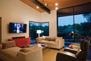
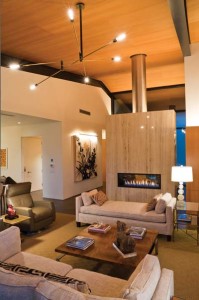
Beyond the threshold is what Suzanne calls the entry space. Two modern chairs and a small table are positioned so Suzanne and Rick can relax and enjoy the modern fireplace. The view through the fireplace connects the entry space to the living room and the treescape on the horizon. The room’s facing walls display two commissioned charcoal pieces by Suzy Davidoff of El Paso. “One of the ways we delineated living and entertaining spaces was with ceiling heights,” Tobin says. “This polished travertine fireplace is 9-and-a-half feet tall and has a stainless steel flue pipe. This draws the eye up to the ceiling, which is made of vertical grain Douglas fir. At its peak, the sloping ceiling is 17-and-a-half feet high.” The living space is simply furnished, with a low sofa, upholstered bench and a modern armchair. To anchor the space, the pair chose an artistic Stalingrad articulated chandelier from Bourgeois Boheme Atelier.
“In the main living space, you‘ll notice there aren’t any recessed lights,” Suzanne says. “Tobin didn’t want the ceiling marred with holes. Much of the illumination in this area is accomplished with uplighting.” A nook in the living room serves as Suzanne’s study. Built-ins house file drawers and bookshelves. The built-in desk is sited beneath a window that provides natural light for study. Between the shelves and the desk hangs a colorful oil painting of a monkey by San Antonio artist Lloyd Walsh.
Casual dining Across the room is the dining area. The simple table is from Nest Modern by Bontempi. It’s made of reverse painted glass on a stainless steel pedestal. Banquette seating and primitive dining chairs seat eight to 10 guests. Over the banquette hangs Peaches and Cream by Juan Farias, another San Antonio artist. “This painting has been the focal point in several of Suzanne’s homes,” Tobin says. “She furnished the living and dining room spaces around this piece.”
Around the corner from the dining area is the kitchen. “We left the kitchen in its original location because of its easy access to the elevator we use to bring up groceries and because of the views out the windows,” Suzanne says.
“The kitchen is divided into three zones,” she continues. “There is the triangular area between the Wolf range, sink and Sub-Zero refrigerator, where most of the cooking is done. There‘s the coffee bar with the peninsula, which separates the cooking area from what we call the buffet. When we entertain casually, I wanted a long counter that would allow us to set food out for guests. This area has a warming drawer, lots of cabinets and drawers specially sized for serving dishes.” The kitchen can be sealed off from the house by sliding closed the pocket doors at either end. Like the living room ceiling, the cabinets are clear-sealed vertical grain Douglas fir, hand-finished with tung oil. The countertop is Caesarstone Quartz in buttermilk. The backsplash is subway tile made of hand-cast glass with paper pulp.
To the left of the front door is a short hallway that leads to the master suite. At the end of this axis hangs a Michael Wayne mixed media abstract Suzanne bought for the house. Wayne is another noted San Antonio artist.
Spacious simplicity
The master suite is a statement in spacious simplicity, providing views of the front and rear of the house. “Our modern approach is about stripping away extraneous elements,” Tobin says. As in other parts of the residence, there is no window trim, baseboards or crown molding. Suzanne recovered the padded headboard for the king-sized bed. The end tables flanking the bed were custom-made to fit the available space. The Fu dog lamps were originally ceramic accent pieces belonging to Suzanne’s mother. The abstract painting over the bed is another Michael Wayne piece. Another pocket door leads to the master bath, where the vanity was custom-made to fit Suzanne. “The cabinetmaker measured me sitting on my vanity stool so he’d know what height to use for the countertop and makeup cabinet,” she says. The makeup cabinet has a bifold door to save space. A sheet mirror hangs over the double vanity; a television is centered in the glass. The tub sits beneath large corner windows and a Marie Swartz digital photograph of a geisha. The shower is a travertine box with a window that opens, a rainhead shower and a smooth river rock floor.
The large master closet originally had no windows. Tobin inserted clerestory windows to obtain northern light. The cabinets and drawers were all custom-made to meet clothing, boot and shoe sizes for Suzanne and Rick. A laundry chute slides dirty clothes directly to the laundry room in the basement below.
 This basement rocks!
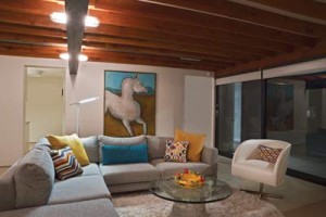
Stairs to the lower level are located off the kitchen. An Arteriors orb fixture lights the way. At the bottom of the stairs hang two paintings originally owned by Suzanne’s father, gifts from San Antonio oil tycoon Tom Slick. A pocket door seals the lower level from the rest of the house, which is handy when Rick is rocking in his music studio, Suzanne says. This level serves a number of purposes. It houses a guest room, full bath, Rick’s music room, Suzanne’s studio, a pingpong table and an area to relax and watch television. The south wall features a large sliding door that opens to the pool patio in the backyard. “Working on this structure was interesting because it was about contrasting experiences,” Tobin says. “Upstairs is about verticality — we raised the ceiling to celebrate the space. Downstairs we worked with compression — the floor overhead was a given, and we could only gain 6 inches in height by exposing the wood joists. By using sight lines, texture of exposed structure and lots of natural light, we were able to create a casual living space that works well for Suzanne and Rick.”
“Rick and I love our house,” Suzanne says. “Working with Tobin was such a great experience — he’s really responsible for the success of the project. I can truly say I can’t think of anything we‘d do differently if we had to do it again. It‘s really perfect.”





0 Comments