Monticello Park in the Deco District was one of San Antonio’s first subdivisions. Located near Woodlawn Lake along Fredericksburg Road, the neighborhood had architecture including an amazing variety of revival, English Tudor, colonial, craftsman and bungalow-style homes, separated by very narrow streets that were not designed for curbside parking.
Linda and Michael Attwood were looking for an affordable fixer-upper when they found the duplex in Montello Park 28 years ago. Linda was an art director, and Michael was a studio photographer; the couple had two small children. They were looking for a place where they could live and work.
“We knew this neighborhood would become something special,” Michael says. “Back then, there was no Deco District, no historic designation. Parts of this area were pretty run down. But we could see there was something unusual in this area, and we wanted to be a part of it.”
“When we saw this place, I thought, ‘Oh, not a duplex! That’s too much work!’” Michael recalls. “But because this place had two addresses, it worked out well for the business and our residence. It was easy to keep the two separate.”
“But it was a wreck,” Linda says. “Everything was original. Nothing had ever been remodeled. There was no central heat or air, and the rooms were chopped up in the strangest ways.”
“I knew I had to gut the place,” Michael says. “We knocked out walls and reconfigured rooms. We relocated the entry of the upstairs duplex and opened the interior staircase to the downstairs. There’s lots of sweat equity in this house.”
“We lived in scaffolds and rubble for years,” Linda says. “Our kids thought that was normal!”
Mirror Image
The duplex is 2,900 square feet; the upstairs and downstairs are mirror images of each other. A small carriage house holds Linda’s classic 1960 Karmann Ghia; the garage apartment serves as a guest house. Several years after the Attwoods completed the duplex renovation, they built a large two-story photography studio next to the carriage house.
The red oak floors in the main house are original. Where necessary, the Attwoods sourced replacement parts from Discovery Architectural Antiques in Gonzales, Texas. “We sourced replacement doors and glass doorknobs there, too,” Michael says. “We believe in recycling and repurposing, so we were glad to find that place.”
The Attwoods are always amazed at the quality of construction in their home. “This place was built in 1928,” Michael says. “We expected cheap construction, but it is more solidly built than new homes. You can’t find the quality of wood that’s in our framing and the thickness of our walls in new construction. The interior walls look like plaster, but they are actually hand-troweled Portland cement.”
Japanese, Scandinavian Influence
Linda drew her interior design from Japanese and Scandinavian influences. “I like clean lines and simple furniture,” she says. “We love nature, the beach, art and music, and we’ve used those elements in our home.“
The downstairs living room features a comfy couch and chair positioned to watch football games on the big-screen television mounted on the opposite wall. Several of Michael’s photographs hang over the couch. A drum serves as a coffee table and as a source of percussion provided by grandchildren. These music enthusiasts also play the baby grand piano beneath the staircase.
The gas fireplace near the front door is unusual because the tile surround is made of rare Muresque tiles, manufactured for a brief period in the 1920s and 1930s in Oakland, Calif. These tiles were very often sculpted with landscapes and were applied with a special glaze. The Attwoods are fortunate in that both their fireplaces are made with Muresque tiles.
When Michael removed the front door to the upstairs apartment, he also removed several feet of the adjacent wall. He built two glass block walls in the space, a nod to the Art Deco neighborhood style. “We love the clean look of the blocks and the way the light filters through them,” Linda says. “When the sun hits the blocks just right, there are prisms of color dancing across our living room walls.”
A long dining table separates the living area from the kitchen. “This belonged to my mother,” Linda says. Dinner parties and family gatherings are held here, rather than in the upstairs quarters.
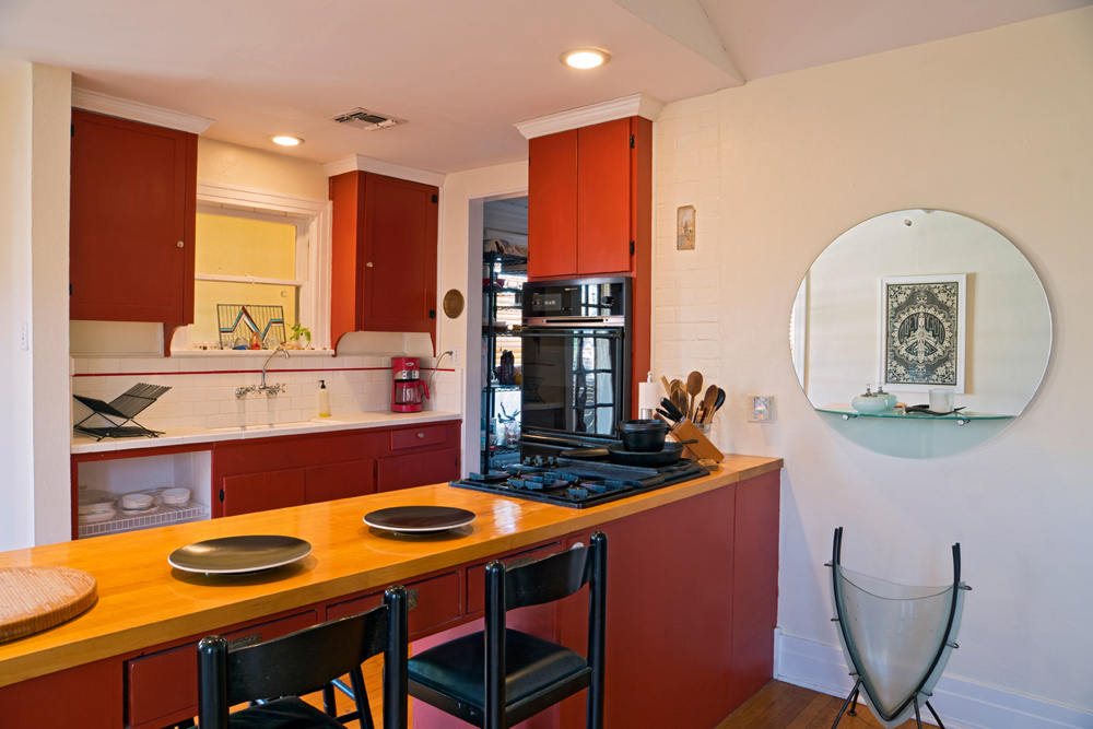
“Michael did a lot of food photography before he retired,” Linda says. “He used this kitchen for the food stylists to prepare what he photographed in his studio. This needed to be a functional space.”
Functional didn’t mean fancy. In the remodel, the Attwoods left the original cabinetry intact, installing a butcher block island to create more space for food prep. The sink is original, as well. The mud room became a pantry, where the washer, dryer and refrigerator reside. The fridge received a coat of chalkboard paint and is a favorite chalk canvas for the grandkids.
A bi-fold screen at the right end of the dining table was made from the swinging café doors that used to open into the kitchen. The screen separates the living area from the bathroom, the art room and the guest room.
The art room contains Linda’s first drawing table, an antique that saw many years of use. The original Central Market sign is there, too, since it was one of Linda’s accounts. Her hand-tinted photographs are displayed, as well as her vintage surfboard. “I do not surf, but I like the idea of it,” she says.
There’s an antique Pachinko machine from her childhood leaning against the wall and a stained glass state of Texas hangs above it. Michael’s brother made it.
The guest room is the grandkids’ playroom when they visit. One wall is lined with bookshelves containing all kinds of books, toys and games. A futon doubles as a guest bed and a place to sit and play.
Second-Story Retreat
“Upstairs is really where we live,” Linda says, leading the way up the red oak staircase and through a door that opens into a small dining area. To the right is a large master suite, which was the living room in the former duplex. The wood-burning fireplace at the far end of the room is beside the door that opens onto a balcony.
“We love our balcony,” she says. “We sit out here and watch the neighbors go by. We have a great view
of the city’s Fourth of July fireworks, as well as
those over Woodlawn Lake.”
The master suite has a tray ceiling, achieved by opening up the attic. “All the rooms up here have unusual ceiling treatments because we tore out the attic to raise the ceilings,” Michael says.
The upstairs kitchen is identical to the one downstairs, except the cabinetry is painted red. “Red is a color I love,” Linda says. “It’s full of light and energy.” The kitchen door opens onto a deck where the couple often share morning coffee. The deck overlooks the tropical garden they’ve planted between the downstairs kitchen and the studio.
Michael’s media room was once a bedroom for one of his children. Now it holds a black leather couch opposite the big-screen TV. His old 8-by-10-view camera is positioned in the corner, as though ready to photograph the room. A musician himself, he leaned his red lacquer guitar up against a console, ready to be strummed when the whim strikes.
The other bedroom is now an office and a dressing room. An old Art Deco wardrobe and an antique dresser hold clothing, because as Linda says, “These old homes don’t have much storage space.” The computer station in the corner indicates that even though the couple are retired, they still work occasionally.
Fresh from the Garden
Linda and Michael are avid gardeners. Michael built Linda a beautiful greenhouse as a retirement gift. Here she spends hours potting and tending her plants. Behind the greenhouse and the studio is their organic garden, where they grow all kinds of vegetables, from asparagus and peppers to snow peas and tomatoes, depending upon the season. “We’ve been at this so long that many of the vegetables now seed themselves,” Michael says.
“We eat what we grow,” Linda says. “I think it is important for our bodies to be fueled with organic food. Even though you can buy organic in the stores, the only way you really know what you are getting is to grow it yourself.”
Doing it yourself has been the couple’s theme in this house for nearly 30 years, and they wouldn’t have it any other way. “We’ve learned so much in this house about remodeling old homes, repurposing materials and about each other,” Michael says. “It’s hard to believe we’ve lived here this long and that our grandkids are now running about the place.”
“It’s been a wonderful neighborhood to grow up in and a great house for us,” Linda says. “Every day we get up and feel glad to be here.”
By Robyn Barnes
Photography by Al Rendon


0 Comments