The classic façade of this Olmos Park house on the tree-lined street is striking. You’d expect the interior to be similar to others on this winding avenue — elegantly decorated in sedate tones. What you’d find once you crossed the threshold, however, would surprise you. And it proves the old adage that the third time is the charm.
Midtown Move
The homeowners moved to Olmos Park five years ago to escape the traffic of their north side home. Their children attend a private school that required a long drive, and chauffeuring frequent after-school activities consumed too much precious time. The Olmos Park home, while requiring some renovation, seemed like a good solution to the problem. The 8,000-square-foot house had four bedrooms, five full baths and one-half bath. There was a guesthouse out back, as well as a pool. Good amenities for a busy family. They hired an interior design firm and explained what they wanted done. At first, the designer seemed like he’d deliver on their dreams. Partway into the project, he seemed to lose the vision and was dismissed. A second firm was hired. Again, the vision was conveyed with photographs and descriptions of the desired color palette, look and feel. Again, the design team ignored the homeowner’s directions. Acute disappointment was the result. “I didn’t want to spend time here,” the homeowner said. “I was so irritated that they hadn’t paid attention to what we wanted. I wanted something light and airy, and what they gave me was something heavy, dark and kind of Tuscan.” Resigned to living with the result, she passed by a new interior design store on McCullough. Joyeux Home Décor had a chair in the window that called to the homeowner every time she passed the store. Finally, she stopped and inquired about the seat. She met a new designer.
“I told her my story,” the homeowner says. “Dy Lynne said she’d stop by the house to take a look. I showed her pictures to illustrate my ideas. We went from room to room so I could tell her what we wanted to do. She quickly picked up on the look we were after.”
Fast Forward
Dy Lynne and her husband, custom builder Jack Dabney, went back over the house again, showing the homeowners what could be salvaged and what would have to go. They kept the travertine and wood floors and the carved cabinetry. They donated hundreds of pounds of tile, countertops and other building materials to local recyclers and charities. From start to finish, the project was completed in three months. That included custom-made furniture, ironwork, cabinetry, paint and countertops.
Airy, Elegant and a Little Bit of Bling
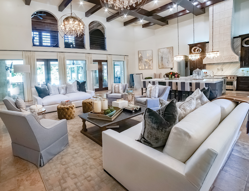
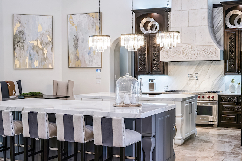
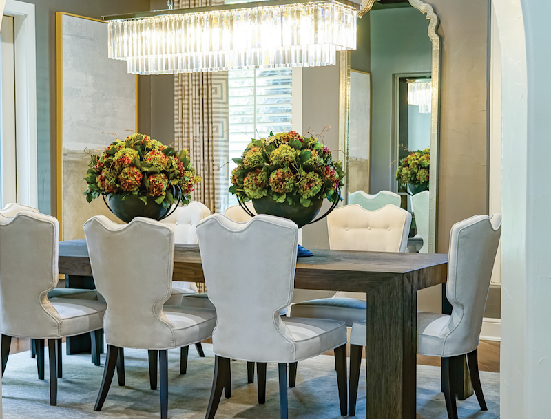
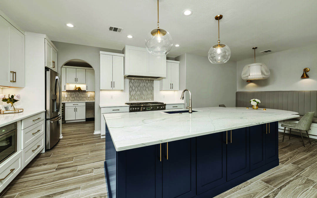
The entry features reclaimed barn wood on each wall. A baroque crystal chandelier provides cascades of light from the 20-foot ceiling. Extra electric outlets were added to accommodate new sconces that flank mirrors to accentuate the natural light filtering through the arched front door. Step through the arch into the great room, where the coffered ceiling soars overhead. The kitchen dominates the right side of the room. Two parallel islands, one for food prep and one for serving, separate this area from the rest of the living space. The islands and backsplash are surfaced in Calcutta gold marble. Three crystal chandeliers hang over the prep island, which houses the dishwasher and a large farmhouse sink. A six-burner gas stove is on the far wall beneath a beautiful carved faux stone vent hood. All the appliances are stored behind dark wooden cabinetry with heavily carved fronts. The expansive islands provide extensive storage opportunities, fortunate for a family that likes to entertain. The family’s daily meals are taken at a rectangular table in the far corner of the room. The table has a zinc surface and a wooden base. Four comfortable upholstered chairs gather round the table, providing a great place to share food and the day’s events. The formal dining room is off the kitchen. A rectangular crystal fixture hangs from the coffered ceiling over the rectangular table that seats eight. French doors open onto an enclosed patio on one end of the room.
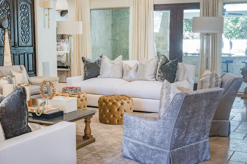
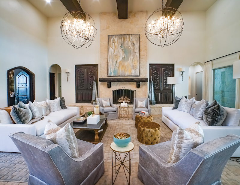
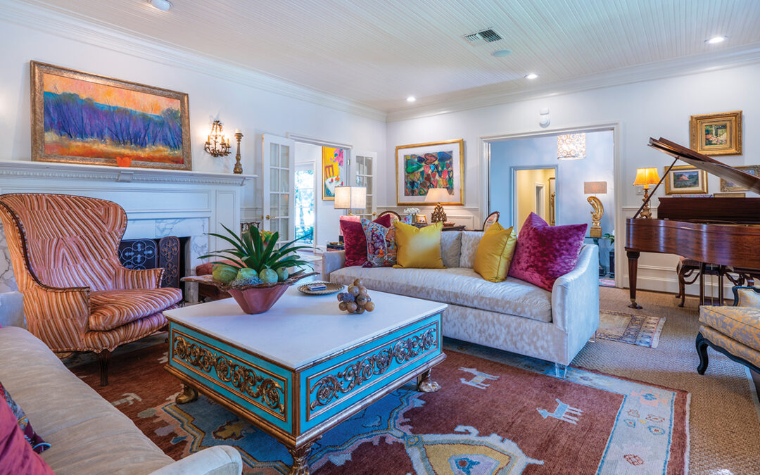
Opposite is a built-in bar with a marble countertop. The backsplash is a work of art, made of marble with water-jet cut infused glass. Adjacent to the bar, a wall of frosted glass was installed to separate the dining room from the wine room. The family’s initials were applied to the glass as a decorative addition. The living room is anchored by a large fireplace featuring a heavy mesquite mantel supported by iron wedges. A 7-foot tall painting by local artist Elaine Ryan hangs over it. Two flanking white sofas and four swivel chairs offer seating, while two large orb chandeliers provide overhead lighting. “We had recessed lighting throughout the house when we moved in,” the homeowner says, “but it wasn’t enough, so we added extra cans and changed every light bulb to LEDs, which significantly brightened the house. The extra cans made a big difference in the living area.”
Originally the house ended at the French doors that open onto the patio. A second floor was added over the patio to serve as the husband’s hunting trophy room. The room is visible from the living area through an iron railing custom-made for safety and decorative appeal. The powder room, with the exception of the backlit onyx vanity, was totally remodeled. New plumbing fixtures were installed, along with custom lighting. It’s the only room with a dark palette; the rest of the house is painted in white.
Total Transformation
The homeowner says the master suite was completely transformed during the third renovation. “This room used to be so dark,” she says. “The furnishings, bed linens, the wood — everything was so dark and heavy. The bedroom now features a gray tufted headboard that is 7 feet tall and wider than two king-sized beds. A white sofa and Mongolian sheep bench sit at the foot of the bed. All the linens and accent pillows are done in shades of gray and white. Two paintings by Dallas artist Scott Kerr hang across the room from the tall windows dressed in white plantation shutters and custom draperies. A large crystal chandelier sparkles overall.
The master bath is striking. The room is dominated by an oversized round tub and curved wall shower surround. Both are set with gold metallic tiles. “I really hated this tile,” the homeowner says. “We wanted to rip it out. But it was so expensive that we didn’t want to waste and that we could find a way to work with it. She found the crystal mobile that hangs from the skylight over the bath, and that diverts the eye. She also combined silver fixtures, sconces and mirrors to mitigate the effect of the tile. I can live with it now.”
The master closet is a thing of beauty. The entire room is wooden cabinetry, enclosing the couple’s wardrobe. The island in the center of the room is an elegant marble-topped dresser, custom-made to hold clothing and accessories. The crystal chandelier over the dresser, supplemented by can lights, illuminates the room. The family room is at the back of the house. French doors open onto the patio, and windows in a conversation alcove allow the couple to keep a close eye on swimmers in the pool. The room’s kitchenette provides the family access to snacks as they watch television on the made-to-measure couch. “The alcove was useless to me, so we installed four comfortable swivel chairs and draperies, along with a coffee table. Now it’s a great conversation area.”
Trophy Refuge
Every hunter wants a magnificent place to display his mounts. In this case, a special room was added upstairs to display the husband’s many trophies. The barrel ceilings reptilian finish is an interesting contrast to the coffered ceilings in the adjacent living room. A fireplace was installed at one end of the room and a home theater at the other. The center of the room is dominated by a pool table and sofa. Shiplap lines the walls, complementing the wood floor.
“I can’t tell you how happy I am with this home now,” the homeowner says. “Everyone who visits says it feels so light and airy — and that’s the feeling I want them to have. I love all the fixtures and the furniture. It took a long time to get it right, but now it’s perfect.”
Which proves that the third time is the charm.
View slideshow:
By Robyn Barnes
Photography by Fredrick Wilson









0 Comments